About two saturdays ago I attented the thinkla.org event on Advertisemet Design. I am glad I went at least one of the days of two available. It really gave me insight on a potential field in graphic design I will like to take on. I learned about different kinds of Media, Account Planning, Interactive Design, & printing process. I really enjoyed this event because I got to learn first had on what it takes to be a succesfull advertisement designer. One of the usefull links that was given to me was that of : www.linkedin.com. For those of you who have not join or do not know what it is about; its mostly a networking site for business professionals. There is strong emphasis in graphic and communication arts networking. Some of the employers even said they do look for potential.
Overall it was a successful and insightful carrier day and I hope that most of you will take time to check out www.thinkla.org. Thanks to my professor on providing information on this event, I am now very exited to pursuing a career in advertisement design.
About Me

- Scarlet Juliette
- I am a freelance graphic designer. I consider my work to have symbolic connotations along with dynamic colors that fit the motive or ideas behind each piece. I enjoy the Fine Arts but do most of my work digitally.I like to experiment with all sorts of medium and currently still developing my Design techniques and portfolio.
Sunday, October 26, 2008
Tuesday, October 14, 2008
In all things comic books regain supreme?

I know that design is not just limited to poster of movies or promotion of product. Let us look at the some other types of design, like that of comic books. Comic books are one of most oldest types of design out there. The whole comic book world revolves on interesting images and characters. I wanted to mention the new upcoming comic book movie based on the best selling novel "The Watchmen." The movie itself looks quite appealing to the eye. But, for comic book lover we all know this movie can be better. But, unlike other movie poster this one seemed catch my eye. The tradional smiley face caught my eyes. At first I though, oh its an animated movie. Up until I found out who the "The Watchmen." I thought this comic book movie is worth mentioning. The design on these posters is simple but is eye catching. I especially like this one. I like how well the vertical typography fits the whole movie poster. A grid approach was used here as well, very well noted in the borders around the main image.
For those of you who are comic book lovers, dont worry here is an actual novel cover, which is in my opinion typical of comic book covers yet great to look at.

So I think we should take some time to appreciate comic books more often these days. By far one of the most blockbuster movies have been based on comic books. Take for instance Batman Dark Knight movie. This movie was huge blockbuster. The whole concept of a new Batman just gave way for new and old type of movie audience. I just wanted share some movie posters from this blockbuster. I do enjoy low budget movie posters as well I wanted share my hidden admiration for comic book design and movie posters

Oh and heres just a comic book cover I enjoyed too. Those are my thought. Seems like movie and comic book covers have strong resemblence these days. Something in these characters and covers work very well together that it keeps captivating us.

Wednesday, October 8, 2008
Old Design versus New
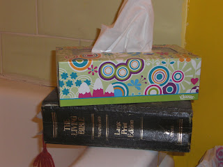
As of recently I was making trip to my local target I spotted this kind of funky retro 70's looking tissue boxes. Needless to say I got 4 of them for 2.99. Once again I saw same tissues box I bought in a traditional old school looking bathroom. The tissue box has a better design in comparison to the horrific flowers on curtains and the wallpaper. The flowers are just bad in design. Only thing I like about this bathroom is how it photographed: yellow and green are harmonious colors but design wise not appropriate for modern bathroom  This box that Kleenex has is available in green and orange colors. I know its an over use design but its caught my attention. The vibrant colors and simple geometric forms makes this box appealing compared to a typical. This got me curious on who was designing these boxes. I found that consumer can design their own kleenex box. It was not too surprising considering how many items can be personalized these days. This site where one can design a personal tissue box:
http://www.mykleenextissue.com/canvas
It's pretty limited because you have to settle with their design and can only upload images. Not to mention the available fonts are so typical. I would love see a tissues box with only typography. But, for the use of tissue boxes, its seems that most of them look the same. Most contain floral design and pastel colors. I did find some hello kitty ones and nature scene ones but so far I liked these series of boxes because they reminded me of the 70's (peace and love design) and vibrant colors. The simple shapes say it all: Mondern design.
If any of you know some graphic design history there was a period called rococo. I found this nice tissues box on the net and thought to myself, "how times have changed in design," and they sure have even in tissues boxes!
Take look at this Rococo tissues box (somebody actually had this in their car).Nice!
 How many of you have tissue box in your car? I know I do, the vibrant retro Kleenex box.
 This box that Kleenex has is available in green and orange colors. I know its an over use design but its caught my attention. The vibrant colors and simple geometric forms makes this box appealing compared to a typical. This got me curious on who was designing these boxes. I found that consumer can design their own kleenex box. It was not too surprising considering how many items can be personalized these days. This site where one can design a personal tissue box:
 http://www.mykleenextissue.com/canvas
It's pretty limited because you have to settle with their design and can only upload images. Not to mention the available fonts are so typical. I would love see a tissues box with only typography. But, for the use of tissue boxes, its seems that most of them look the same. Most contain floral design and pastel colors. I did find some hello kitty ones and nature scene ones but so far I liked these series of boxes because they reminded me of the 70's (peace and love design) and vibrant colors. The simple shapes say it all: Mondern design.

If any of you know some graphic design history there was a period called rococo. I found this nice tissues box on the net and thought to myself, "how times have changed in design," and they sure have even in tissues boxes!
Take look at this Rococo tissues box (somebody actually had this in their car).Nice!
 How many of you have tissue box in your car? I know I do, the vibrant retro Kleenex box.
Friday, October 3, 2008
Same sex marriage Prop 8. Ad. project


In our advertisement design class with prof. Jimmy Moss we were given task to come out with two different campaign poster for propositions set forth this upcoming November ballot. The proposition me and my partner are developing is same sex marriage elimination. Voting yes on prop 8. will have marriage only between a man and woman. Voting no will keep the current law and allow same sex couples have same rights (civil) as heterosexual couples. I have in between feelings about this issue. I feel that marriage right should be available to all humans wether heterosexual or homosexual. On the other hand growing up with christian beliefs and traditions I also feel that marriage for same sex couples defy "God's intended nature" for humans to not only procreate but also obey his laws. This conflicting because of religious and civil reasons. For now I have no strong position on either side. Rather I will examine both sides and develop ideas for and against same sex marriage.

This is quite controversial issue but the developing ideas for this proposition have been fun. I find myself trying to think out box more so in this project. Advertisement design has always appealed to me because of sense of control of people opinion on product or service. So far my developed ideas have been a bit complicated. I was thinking of sense of political cartoons I seen in my history books. However, I'm trying several different approaches for variety from photography to illustration and even emphasis with only designing with type.
I did some research of the types of images out there now on this issues and posted them here. I'm trying sway away from any negative imagery. The images above caught my attention and think God is strong argument use for and against both "yes" and "no" on prop 8. The cartoon I found quite funny because of two men who speak marriage in terms of sex. Just thought it was bit funny. I'm currently developing 20 more ideas for this project and will be posting them here. I hope I can get you guys feedback. Until then, there is more work to be done, plenty of more work for this project to be successful.
Subscribe to:
Comments (Atom)